Design Approach
-
Social-first structure: people > places
-
Visual system: clean, bold, inviting
-
UX that supports gradual discovery
-
Brand voice that’s friendly, confident, and human


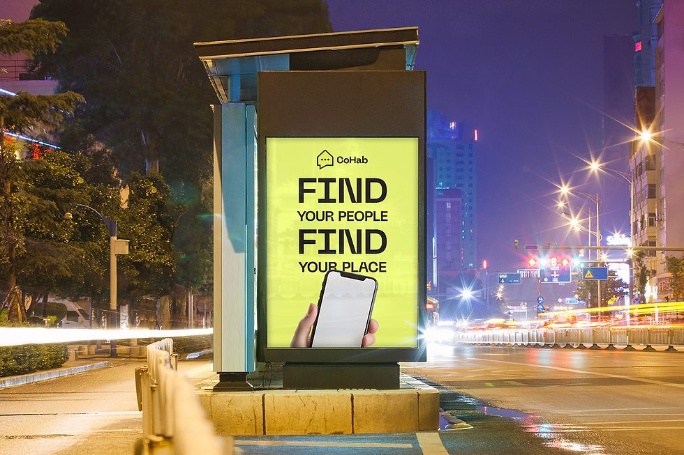
Cohab – People First. Places Second.
My Role
-
Lead Designer
Project Scope
Brand Strategy · Visual Identity · UX/UI Design · Product Thinking
Project Overview
Cohab is a social-first roommate platform designed to help people moving to a new city find connection before contracts. This project involved developing a bold and approachable brand identity, paired with a user-friendly app experience focused on personality-based matching, flexible onboarding, and thoughtful visual design. From logo exploration to UI flows, the work centered on making shared living feel intuitive, human, and community-driven.
Brand Exploration
Logo Development
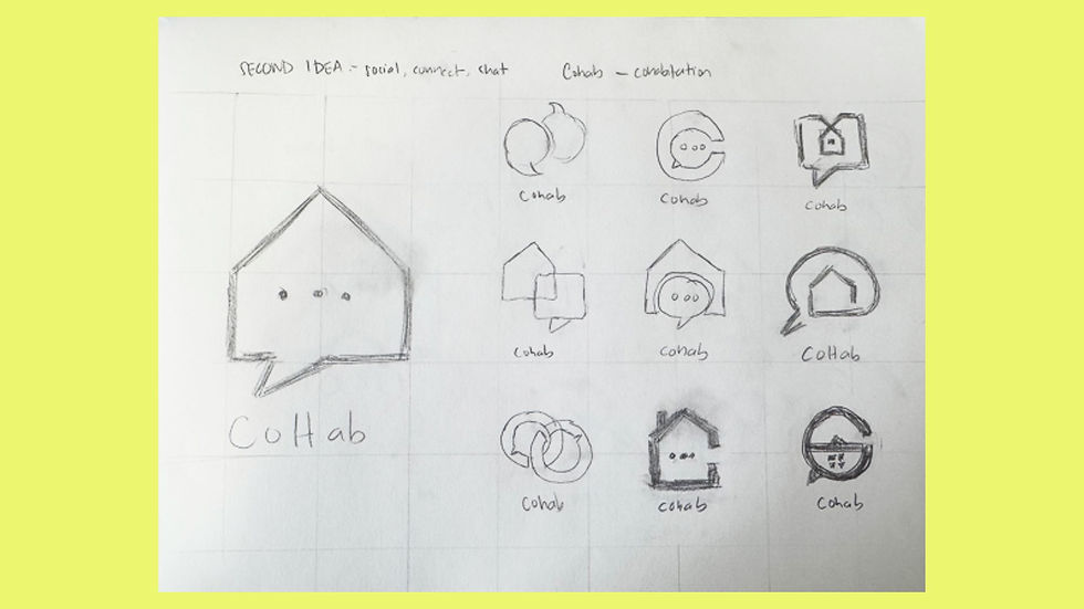
A bold, minimalist mark combining a house and speech bubble.


Color System
The neon yellow represents vibrancy, excitement, and connection, making the brand stand out. Deep charcoal provides a strong, grounded contrast, ensuring readability and professionalism.
Soft white and neutral gray add balance and clarity, keeping the design clean and approachable. A touch of light aqua brings a refreshing, friendly feel, reinforcing CoHab’s mission of making shared living fun and effortless.
App Experience
Onboarding
Fast, low-friction entry. Deeper profile building happens over time.

Dashboard
People come first — roommate matches are prioritized visually.

Profiles
Designed to feel personal, relatable, and interest-driven.

Listing Filters
Smart defaults auto-filled from onboarding, with flexible edits.
